Case study: Vonage
- Project: A web-based virtual reality experience that highlights core products:
– unified communications as a service (UCaaS)
– cloud-based platform as a service (CPaaS)
for enterprise communications at the CPE (Channel Partners Evolution) trade show on September 25–28, 2017 in Austin, TX.
Additionally, a subsequently updated experience at the CPE trade show on April 16th, 2018 in Las Vegas - Role: Lead UX Designer and XR Developer
- Team: 1 Fullstack Developer, 1 Stakeholder, 1 3D Artist
- Tools: Sketching, Sketch, Photoshop, Prototyping (A-Frame & Google Cardboard), Sublime & Github
Who is Vonage?
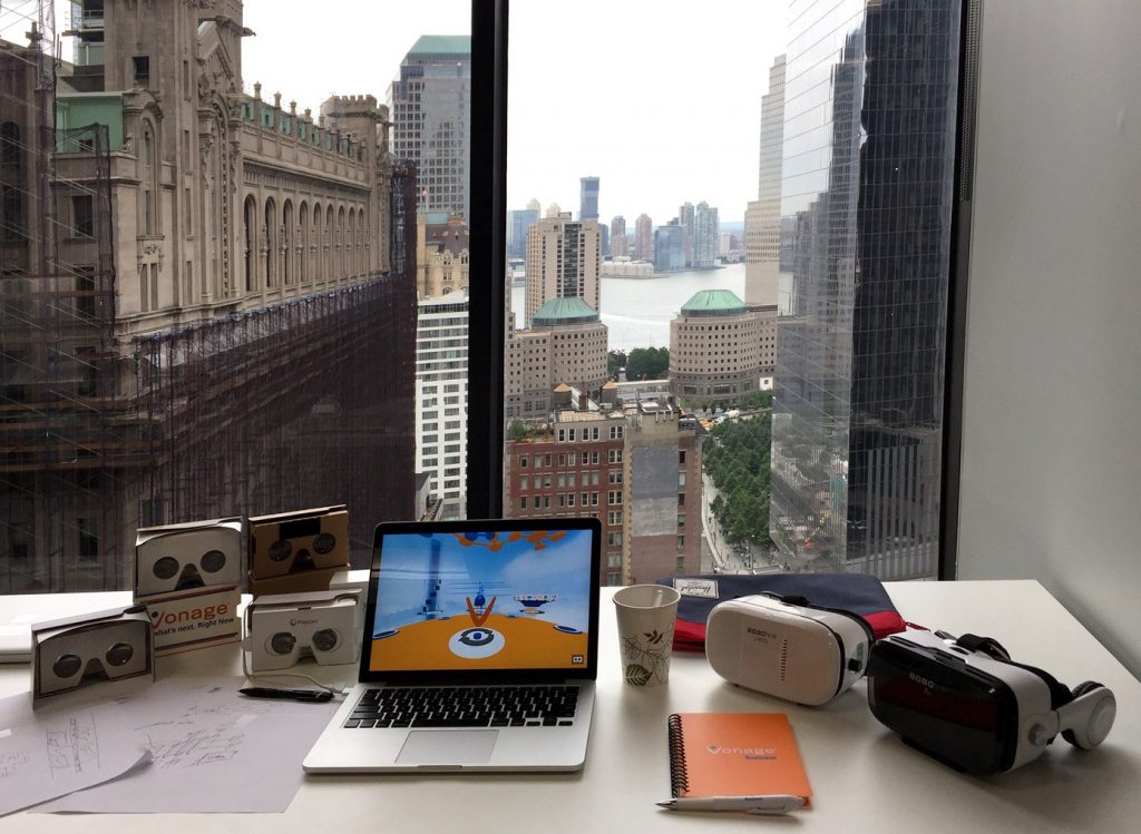
Vonage is an international publicly held B2B cloud communications provider. Vonage Garage is the innovations department, where Vonage employees see their ideas transform from whiteboard drawings to functional proofs of concepts. At the Garage, employees play with innovative concepts in communication, collaboration, and technology.
After interest in immersive technologies started rising at the advent of the Oculus Rift, I was brought in by Vonage Garage to reimagine the way Vonage sells its products on trade shows.
Vonage saw an opportunity to be first to market in creating a shareable virtual trade show experience to capture and retain trade show visitors.
Objective: Targeting trade show visitors
How might we (HMW) …
- draw and get their undivided attention for more than 5 minutes
- capture their name and phone number
- initiate meaningful discussions about Vonage’s products at the venue
- retain their interest and convert them into potential new clients
Exploratory research
Part I: Research on Attention
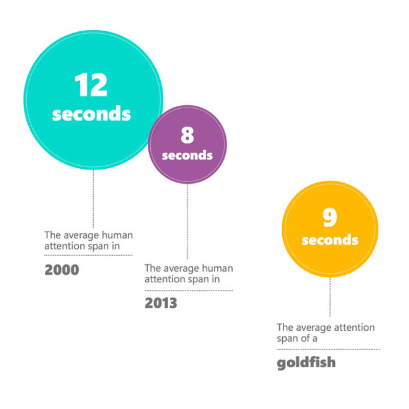
Statistics of a Microsoft research paper (Microsoft attention spans 2015) reported that the average attention span in humans decreased from 12 seconds in the year 2000 to 8 seconds in the year 2013 — one second below the attention span of an average goldfish.
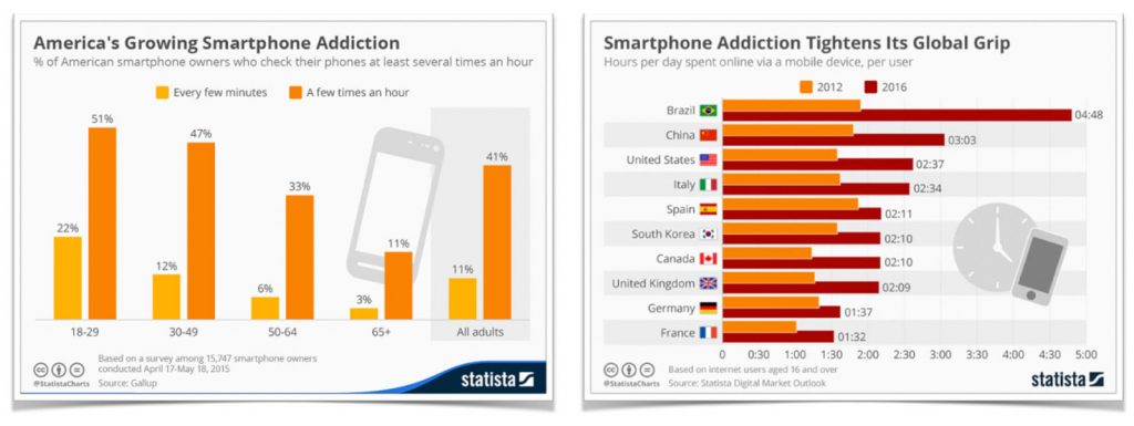
One major contributor to this development is the growing smartphone addiction, as the use of mobile devices becomes an increasingly important part of everyone’s daily lives.
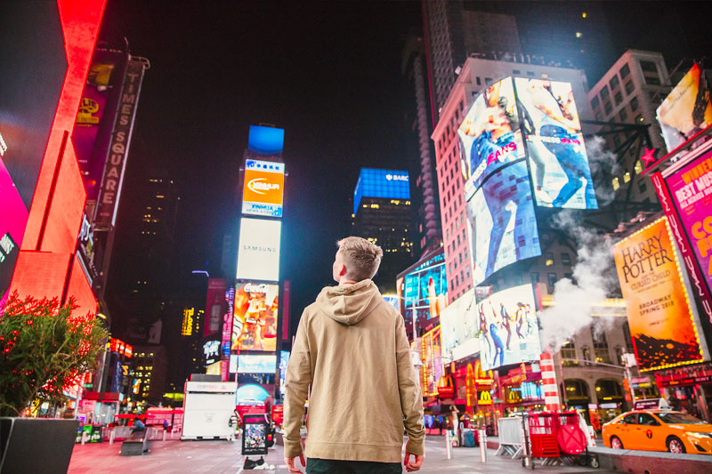
Another factor that is decreasing attention can be attributed to the exponential increase of sensory stimulation.
The use of smart devices becomes a sheltering and isolation mechanism, a way to tune out the noise and overstimulation from the surrounding environment.
In recent years people have conditioned themselves to “tasked-based attention”, which means absorbing bite-sized information through apps like Twitter, Quibi, Instagram, Snapchat, etc.
One way to measure attention is to look at the advertising industry and its primary medium: banner ads.
Heatmap (eye) tracking, time spent in the experience, and click-through-rate (CTR) for the ad units show us that virtual reality as a medium yields the most effective result.

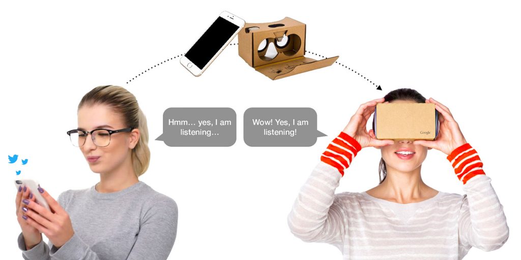
Since mobile VR experiences are using the visitor’s personal smart device plugged into a stereoscopic viewer, we can harvest the visitor’s undivided attention for the length of the experience session.
Low entry barrier
We are creating a web-based virtual experience. It doesn’t need to be installed. It simply runs on the device’s web browser. We also can share the web link to the experience via SMS, providing us with the visitor’s cellphone number.
Part II: Research on Trade Shows
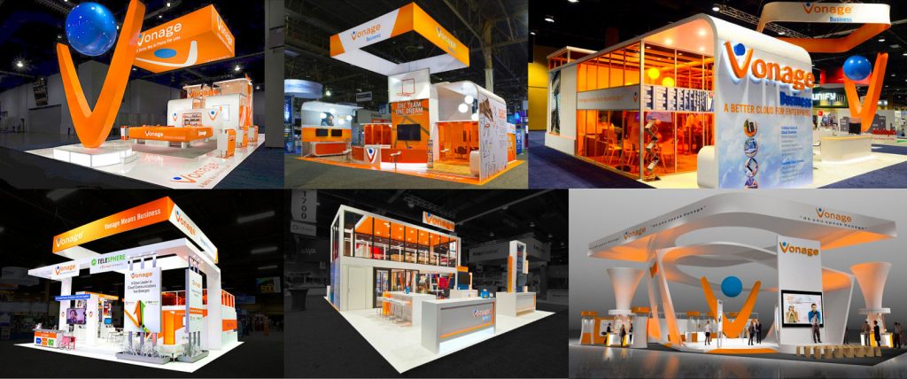
Vonage spends a significant budget on creating open and inviting trade show expositions. The strong blue and orange key colors, reflective surfaces, and angled shapes on a white background are eye-catching and draw in a lot of visitors.
Beside the traditional trade show swag and give-aways, Vonage has offered entertainment to build traffic. A branded Vault Money Booth is a phone-cabin-sized glass box in which a person is trying to catch wind-circulated dollar bills. Raffles with high-value prizes, like a brand new Porsche and gift bags containing high-tech electronics.
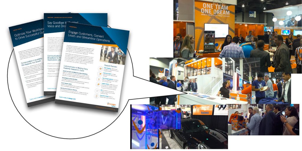
Building traffic is one of the first and most important objectives in a trade show setting. The second crucial part is effectively informing the visitor about the product offering. However, the only artifacts in the booth to accomplish this are plain product spec sheets: one-page summaries of the CPaaS and UCaaS offerings that were educating the potential new customers, why Vonage’s product stood out against the competition.
In our research, we learned that Vonage’s trade show efforts are disproportionately geared towards selling its brand while leaving several opportunities to showcase its products untapped.
We needed to tell a new story to sell the products.
Designing the virtual experience
Visual elements
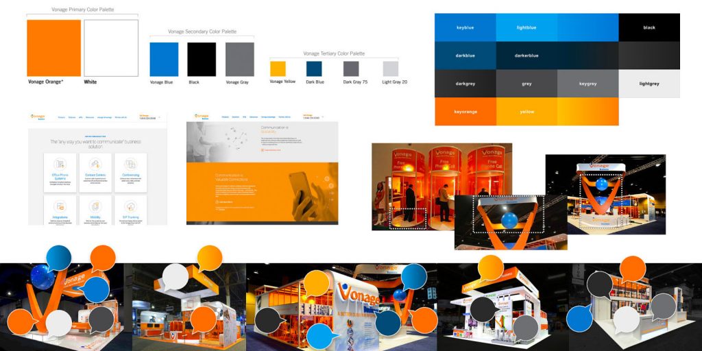
- Branding – key visuals that represent the brand
- Shapes – composition of booth walls, display areas, and furniture
- Colors – most prominent colors, patterns, and lighting
- Materials – surface properties (matt or shiny, smooth or rough)
- Symbols – reoccurring logos, signs, fonts, and geometry
- Digital presence – key elements from the corporate website and social media
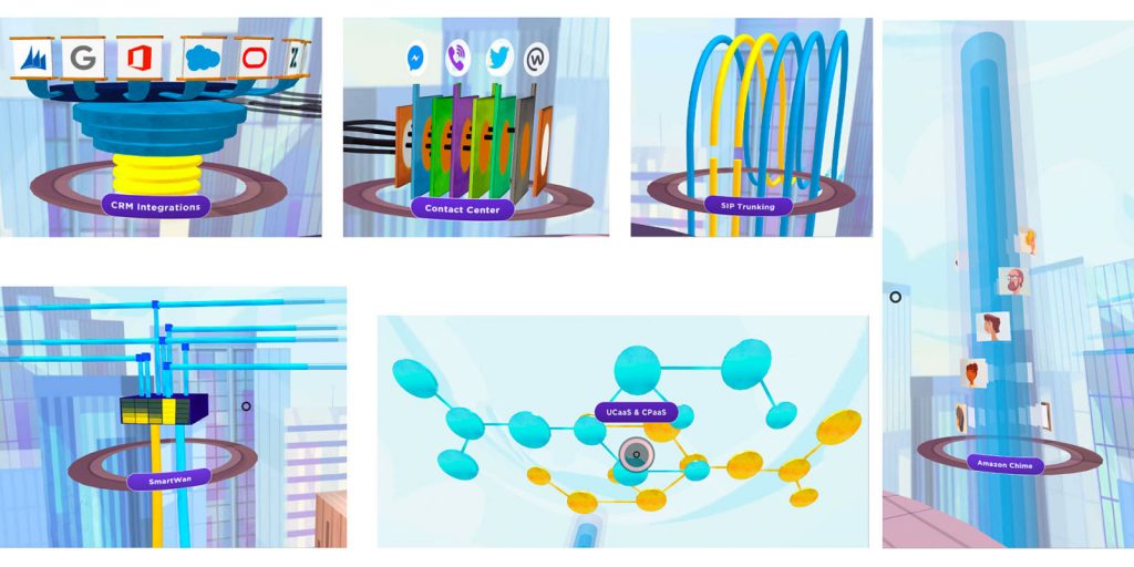
Products featured in the experience
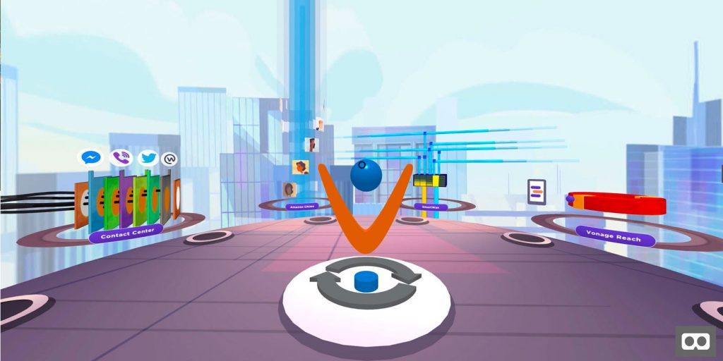
- SmartWAN: SD-WAN technology that connects public or private networks, and intelligently allocates resources, optimizing networks based on prioritized demands.
- Amazon Chime: a web-conferencing and collaboration suite that provides capabilities like audio conferencing, video calls, screen sharing, chat, and document sharing integrated with Vonage’s full range of UCaaS solutions.
- Vonage Integration Suite: powered by gUnify, a service that connects the user to, and interacts with the biggest CRM software APIs, and logs user adaptations.
- Advanced Contact Center: a service and platform that helps the company communicate with customers over multiple messaging services and enables tiered coaching and control.
- Sip Trunking: a geo-redundant cloud service that assures a steady data connection and provides fallbacks for outages.
- Unified Communications-as-a-Service (UCaaS): solutions to enhance connection and collaboration among employees and enable seamless integration with business applications and CRM tools.
- Communications Platform-as-a-Service (CPaaS): technology to create personalized and contextual communications with customers for deeper engagement and more meaningful relationships.
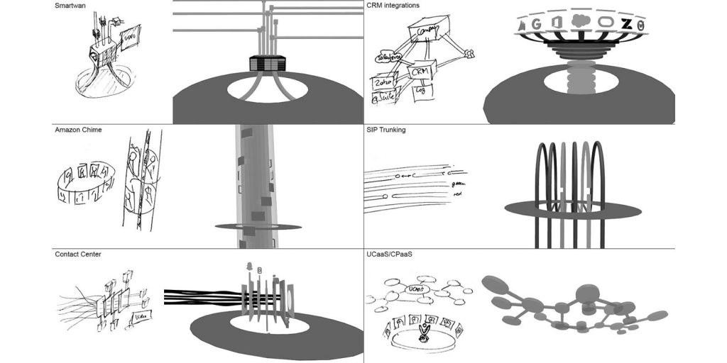
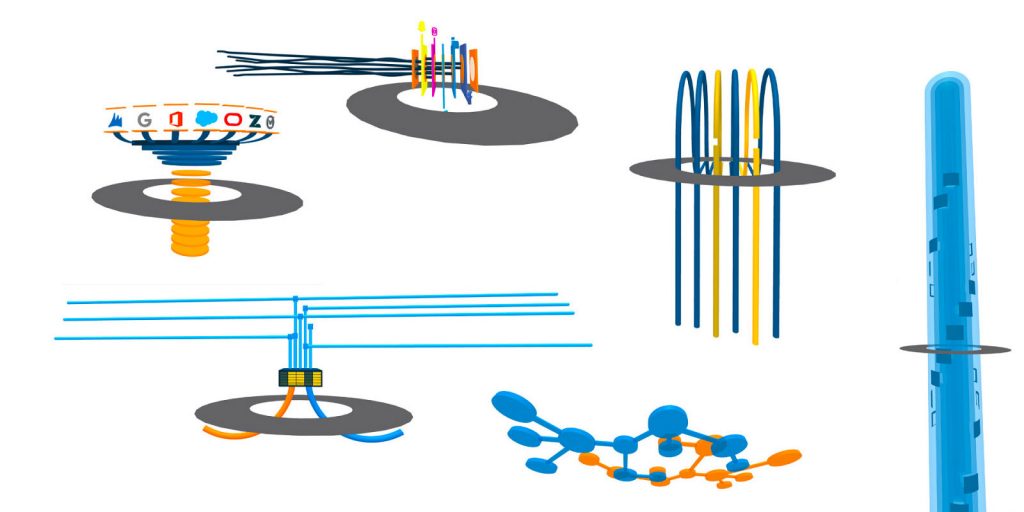
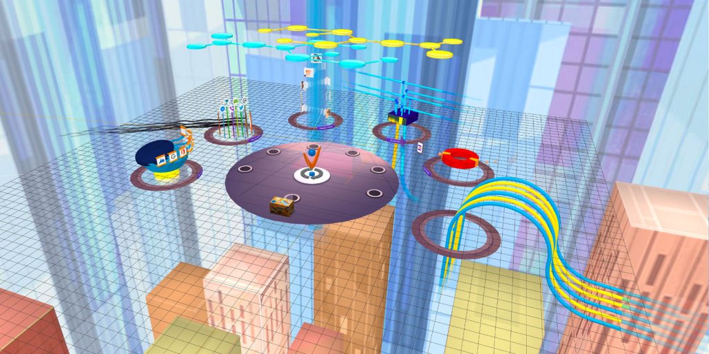
In close collaboration with subject matter experts (SME) and sales staff, we extracted the essence/core functionality of each product and designed a descriptive visualization. Simplicity was key, e.g. for CRM Integrations, you see connecting branches to third-party CRM icons and an animated movement of blocks driving into the cloud, simulating storage.

User flow v1
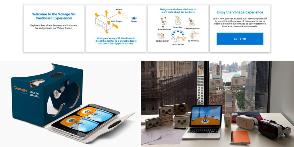
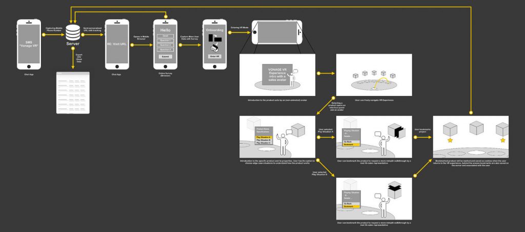
The visitor sends the text message “Vonage VR” to a number that is linked to the Vonage API server. The server responds by sending the weblink to the experience. After loading the link on the device’s browser, the visitor is greeted with an onboarding screen and instructions on how to place the phone into the Cardboard viewer and how to navigate the experience.

Virtual stage: Defining space and proportions
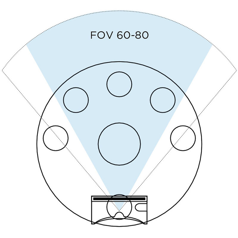
The Google Cardboard, a stereoscopic viewer for your smartphone, provides a field of view (FOV) of 60 to 80 degrees.
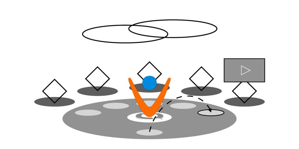
In creating the stage of the experience, it was important that the visitor sees at least 50% of the surroundings to get instantly oriented. The large V (Vonage logo) and Nexmo logo in the center of the stage were not to be blocking the view towards the products, yet had to be prominent enough to be substantial elements.
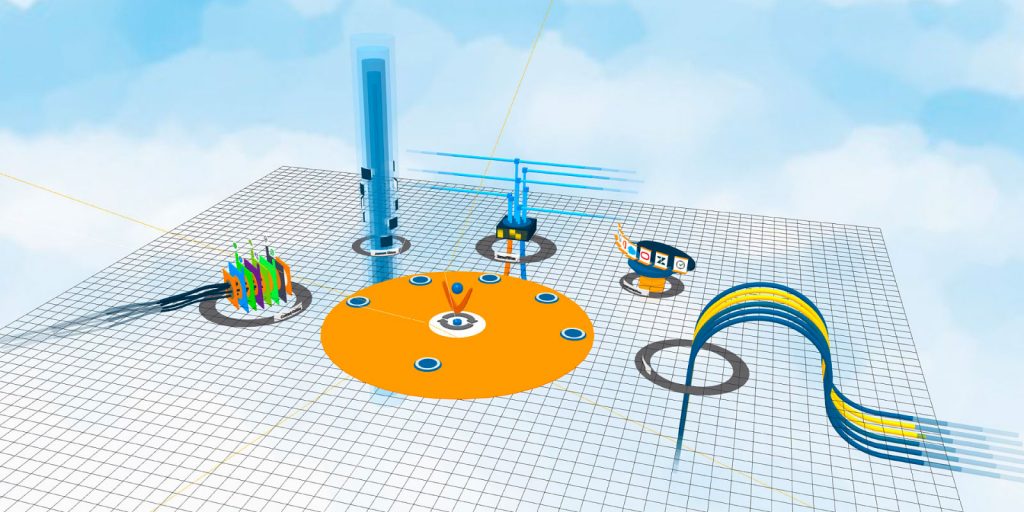
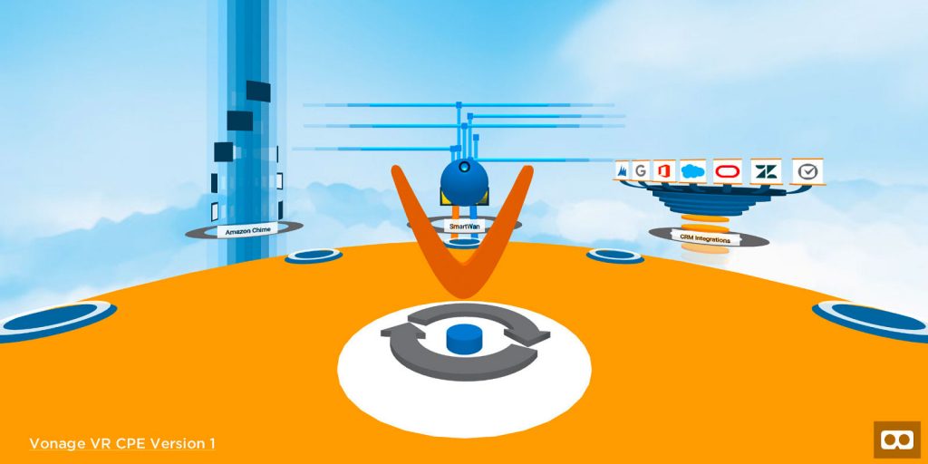
Onboarding, testing and launch of the first version
The onboarding slides show a quick welcome message, followed by instructions on how to interact and navigate within the experience. Next was a stage map that showed the positions of the products. After that, the visitor was ready to explore the virtual stage.
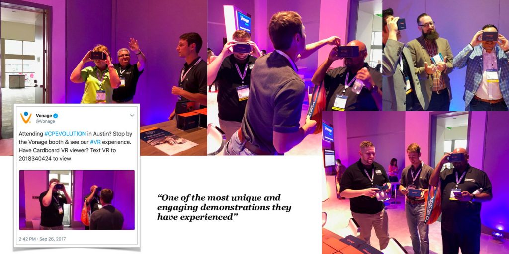
In the Vonage booth at the Channel Partners Evolution trade show and expo on September 25–28, 2017 in Austin, TX
Preparing for the next trade show in Las Vegas
Objectives: Rebrand and capture trade show visitors
- Aligning visual style to new “Communication is Everything” campaign
- Designing dedicated UX for Cardboard and GearVR
- Making four products interactive
- Adding an additional product
- Adding sound effects and background music
- Connecting to an activity at the current trade show booth
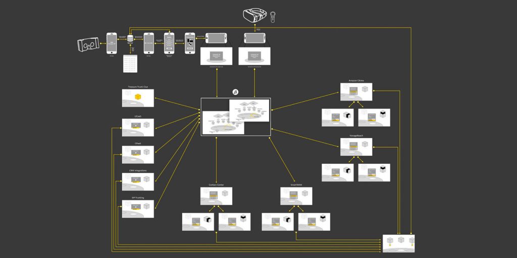
User flow v2
The experience is split into two different onboaring flows.
- For Google Cardboard: the remote visitor sends the text message “Vonage VR” to a number that is linked to the Vonage API server. The server responds by sending the weblink to the experience. After loading the link on the device’s browser, the visitor is greeted with an onboarding screen and instructions on how to place the phone into the Cardboard viewer. Once set up and started, the visitor is prompted to enter their badge number to unlock the experience. The visitor is greeted with an info panel with instructions to navigate the experience.
- For Samsung GearVR: the in-booth visitor is given a rented headset. Once set up and started, they are prompted to enter their badge numbers to unlock the experience. The visitor is greeted with an info panel with instructions to navigate the experience with a remote controller.
The new version of the virtual experience was going to be themed in the style of the newly launched ad campaign “Communication Is Everything” produced by Bear in the Hall / Yeah Haus
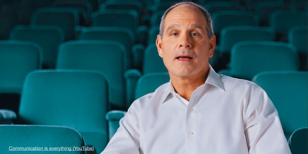
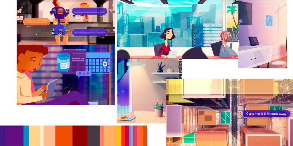
Image assets from the illustrators
Although our budget did not allow for a collaboration with the producers and illustrators of the video, we received the production image assets and color palette that were used in the campaign video.
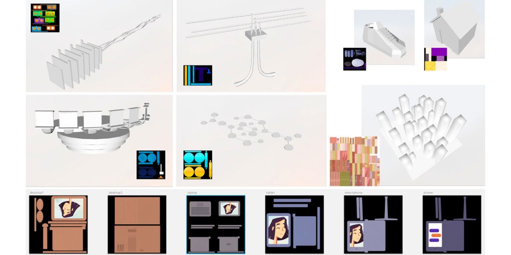
New asset production
New 3D models were integrated into the project, labels, info panels, and typography and UI were matched to the style of the campaign video.

Designing a dedicated UX for Google Cardboard and GearVR
Version 2 of the project features two different interaction patterns based on the devices used in the experience:
- Samsung GearVR headset features teleportation and laser targeting interaction with a remote controller.
- Google Cardboard featured, as the previous version did, the look-at-and-click-style gaze-triggered interaction.
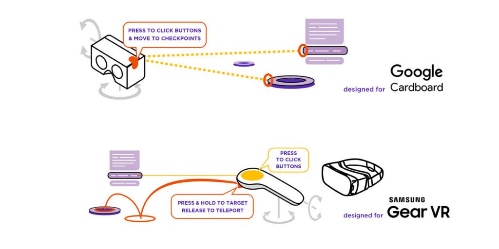
Each device had its own onboarding info panel at the start of the experience.
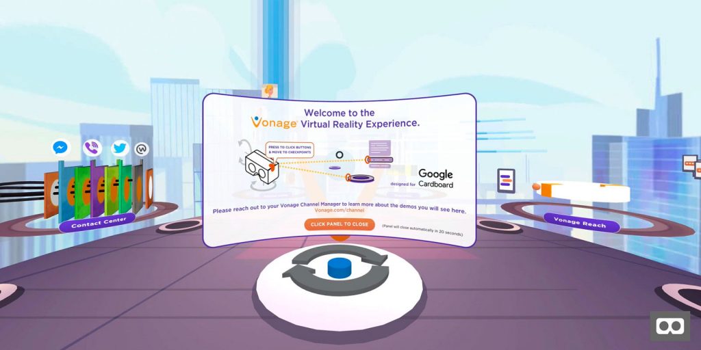
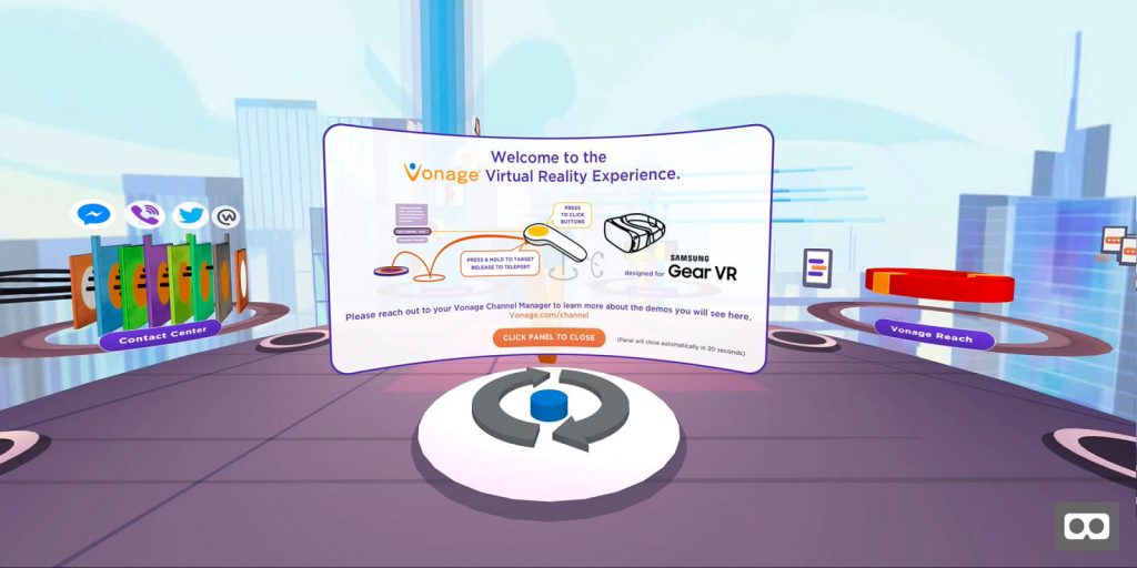
Interactivity – triggering “task-based attention”
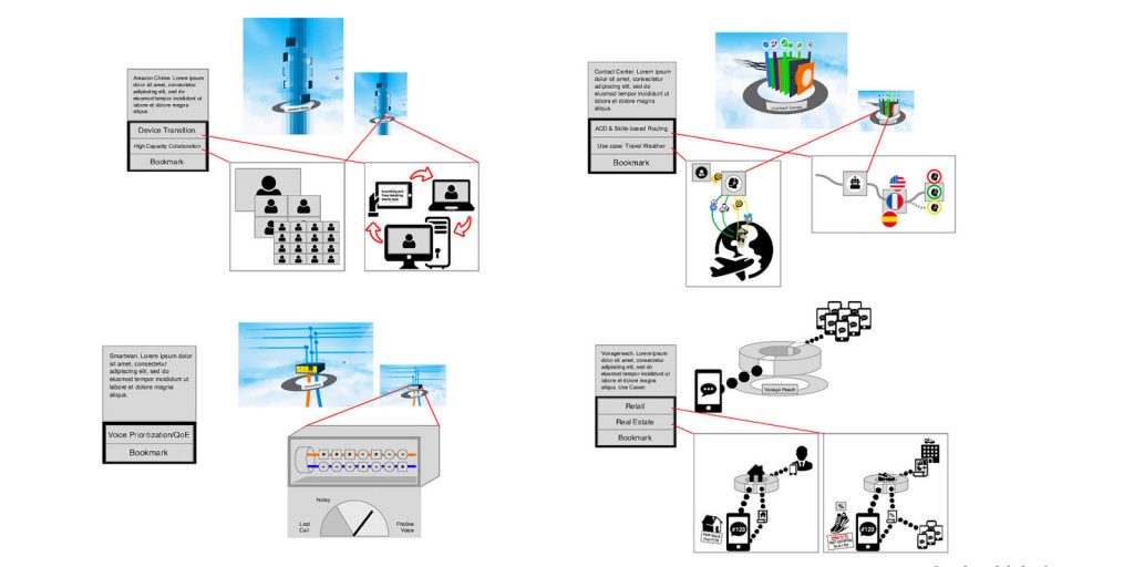
In the updated version, a selection of four products was displaying interactive information panels. Each showed additional features and use cases through small animations.
Example: Amazon Chime shows the capability of switching devices while being on an ongoing conference call.
A Tie-In to “Real Reality”
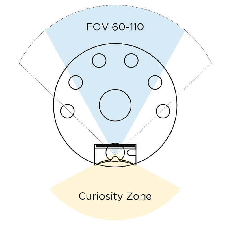
Adding the Samsung GearVR headset extended our field of vision up to 110 degrees, so we considered adjusting the overall proportions of the stage.
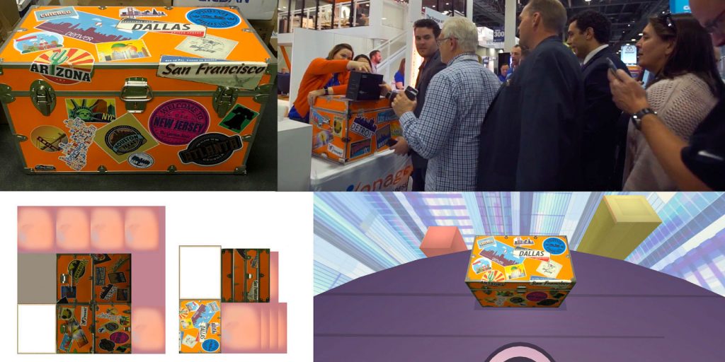
One key element in this new version was to take advantage of the curiosity zone, the place behind the user. We added an element that would connect an activity in the tradeshow booth at the venue with the virtual reality experience.
At the Las Vegas tradeshow, Vonage had a treasure trunk that, at specific times during the event, was opened and the contents were raffled.
Next steps …
User feedback on the client-side surfaced some needs for optimization due to unstable Wi-Fi.
- Dedicating additional resources to optimize performance
- Designing and integrating the user experience for Oculus Go
- Adding feedback loops for user testing and training
- Progressive web application (PWA) for a permanent exhibit at Vonage’s Holmdel headquarters
- A potential feature for version 3 included a guided exploration with avatars
The project has been a great success and raised a lot of attention. It led to meaningful conversations about product offerings at the trade show and was an active tool in the conversion of new business. Seeing the effect, other brands on the CPE trade show floor started to feature VR experiences in the following years.
Vonage was the first brand at the CPE trade show and expo 2017 to showcase its product suite in an immersive VR experience.
Client retrospective
It was a rare pleasure working with Roland. Roland is not only a ridiculously skilled VR expert but also very easy to work with. Together we went over a very abstract mission statement for a VR project, identified opportunities, created a language, and a go-to plan, and built the VR experience.
Zach (Tzahi) Efrati, Senior Director of Innovation & Research at Vonage
Roland consistently demonstrated professionalism and the ability to communicate with stakeholders to a successful delivery. The end result was so well received that the company I worked for hired Roland for additional higher-scope projects.
I will definitely recommend Roland for any XR/VR/AR project and role and will welcome any opportunity to work with him in the future.
WebXR as a Sales Tool – Converting Visitors to Clients Presentation on Notist.
View WebXR as a Sales Tool – Converting Visitors to Clients on Notist.