- Project: A redesign and restructuring of an outdoor gear e-commerce site
- Role: Principal Designer
- Team: 1 Product Manager, a live-action and animation studio team of 2, and a Dev team of 3
- Contributions: User interviews, competitive analysis, information architecture, data tracking, front-end development, pattern library, accessibility testing
- Tools: Miro, Whimsical, Figma, Fractal, ThreeJS, Amplitude, Fullstory

Who is RTIC Outdoors?
RTIC Outdoors is a Houston, Texas-based outdoor gear company run by twin brothers, John & Jim Jacobsen, that gained success in the cooler industry by selling their high-end products for less. They offer high-quality coolers with all of the features customers want – at a fraction of the price of retail outlets by cutting out the big box retailers, using word of mouth & social media to promote their coolers.
We were brought on board by 808, Inc., a live-action and animation studio, to help with the rebranding of RTIC Coolers into RTIC Outdoors with a redesign of their entire e-commerce presence.
Competitive analysis
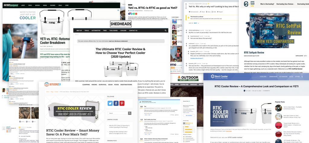
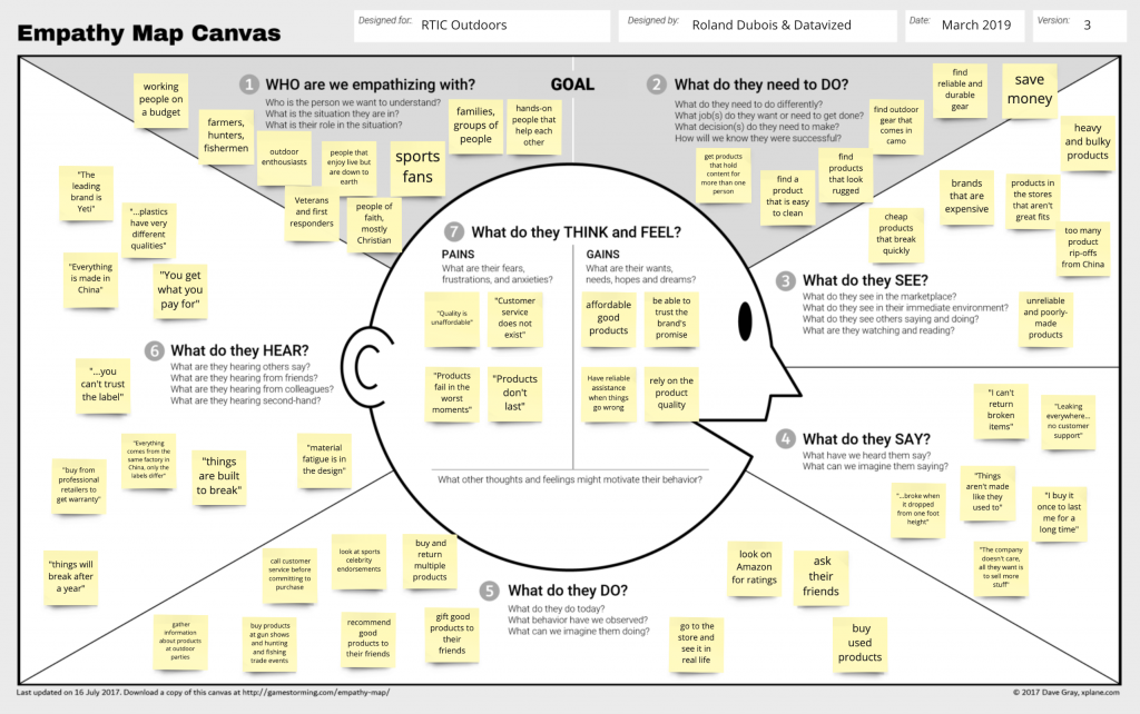
To learn about RTIC’s customers and what aspects of RTIC’s brand promise (the “WHY“) is attracting them to choose RTIC over the competition, we conducted an in-depth competitive analysis. We collected a list of direct and indirect competitors and held remote user interviews with the stakeholders, customer service staff, and a randomized selection of customers that recently purchased products on RTIC’s e-commerce site.
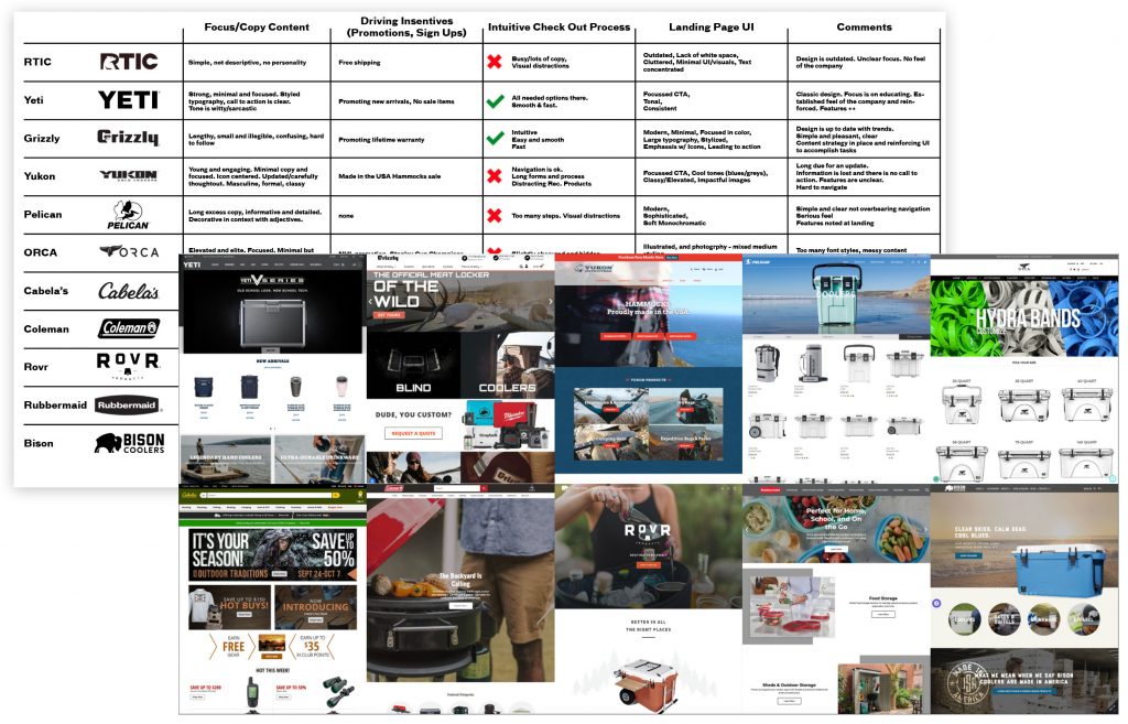
To understand key customer experience drivers and insights buried deep in customer comments and reactions, we conducted a customer feedback analysis by going through forums and business rating sites. This helped us to surface additional customer pain points and potential conversion blockers.
We synthesized and collectively shared our research findings in an empathy mapping workshop that we facilitated with the key stakeholders and the team.
Information architecture
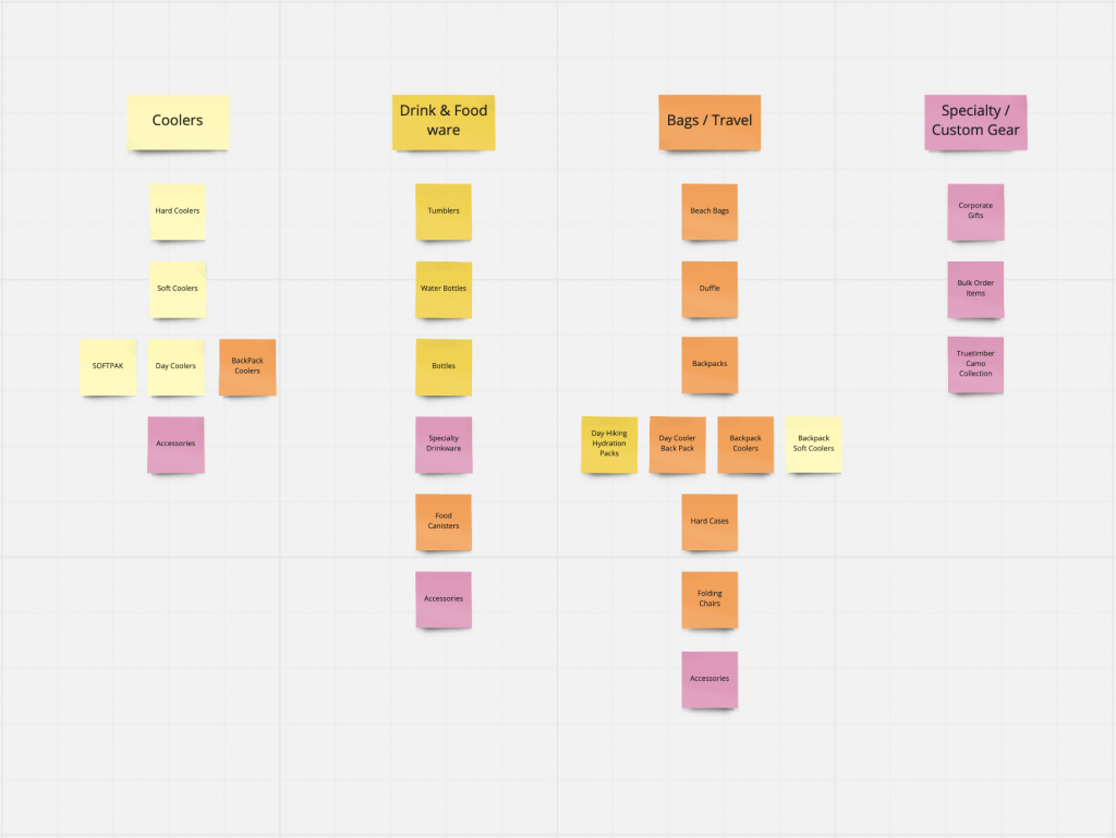
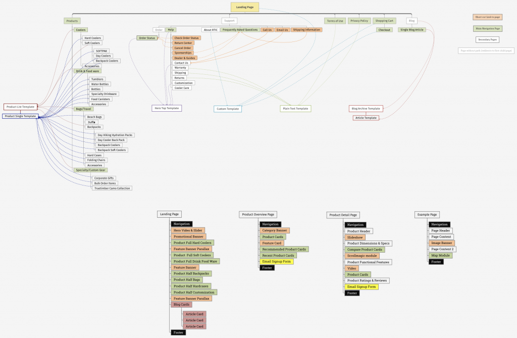
We audited the page structure of the old site and grouped all content by templates, discovered one-off custom pages that may increase design and code debt, and defined the scope of new design templates to create.
Based on our user research findings that surfaced flaws in the current content structure, we conducted a card sorting exercise to rename and reprioritize product categories and rearrange products within their expected context.
We defined the structural design of shared information. Our information architecture (AI) efforts were organizing and labelling the website’s content to support usability and findability.
While sitemaps are used to create a basic structure of content, IA serves as a guide for the user to find the information they need.
Considering the visual design of the site’s pages and templates, our IA goals were:
- Information scent – the user’s perception of context and source value through prior knowledge.
- Avoiding duplication – improving search engine optimization (SEO) and maintainability.
- Uniting IA & page design – removing redundant templates surfaced in the audit.
The design process
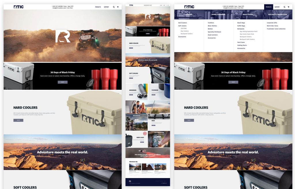
To move surely but also quickly, our design process avoided outdated waterfall methods in favor of quick prototypes and check-ins. For example, instead of expensive and time-consuming full-blown, multi-page Photoshop comps, we designed two style tiles emphasizing different brand attributes. At a glance, our client was able to easily choose the best design direction, and from there, we only built high-fidelity comps of a selection of core templates for alignment. Afterwards, the site was designed in the browser — a method that is accurate, efficient, and appropriate for today’s mobile-first, responsive web.
The style tile is a design deliverable that references website interface elements through font, color, and style collections delivered alongside a site map, wireframes, and other user experience artifacts.
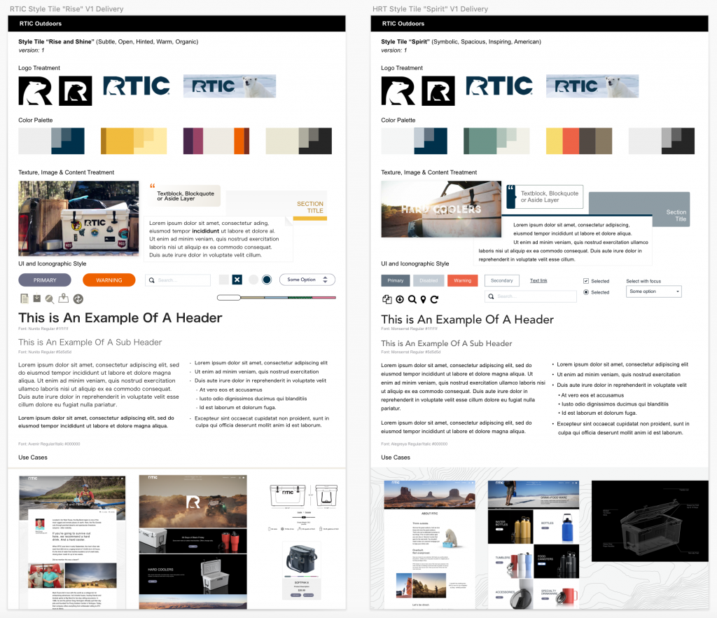
Image & video footage
The visual language of the new site was focussed on two aspects:
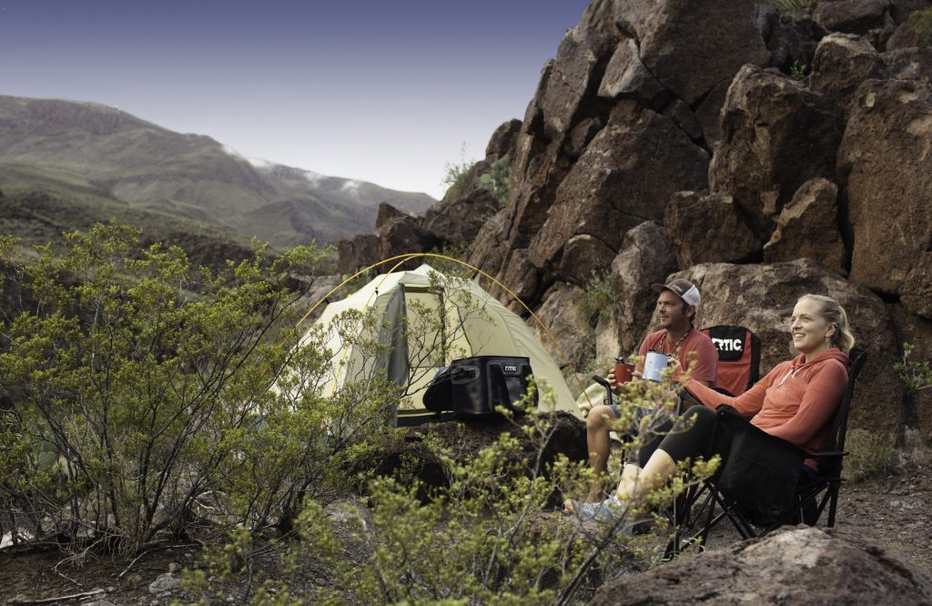
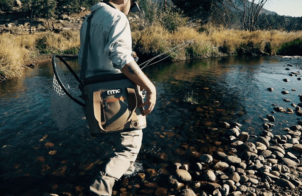
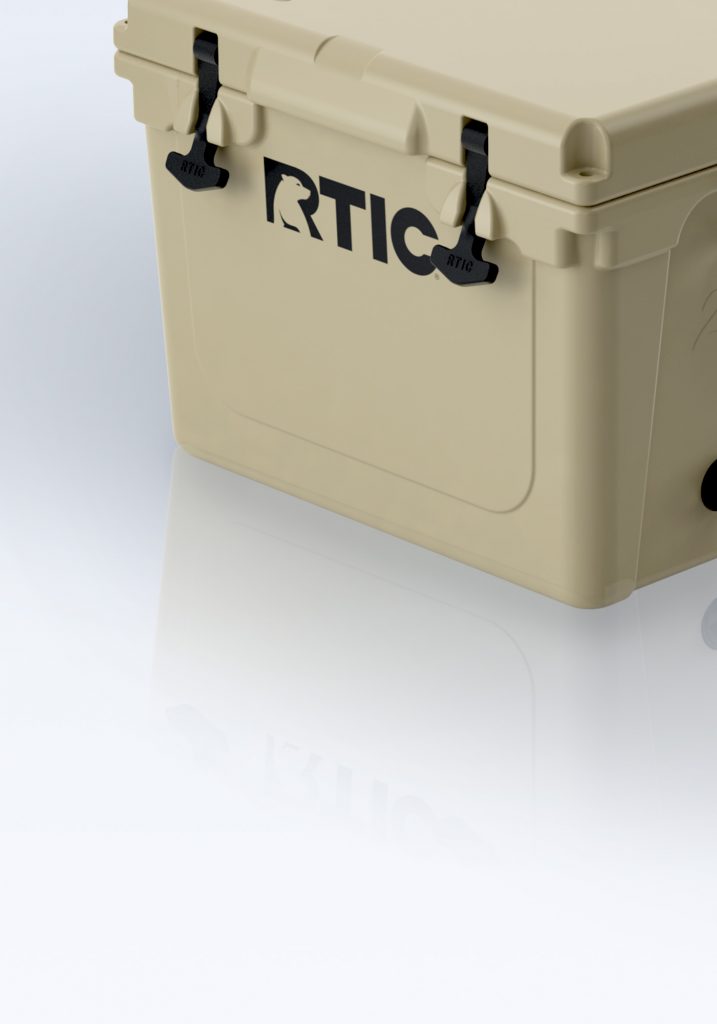
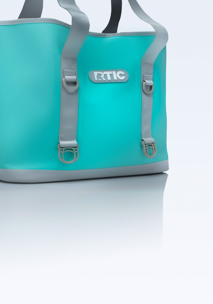
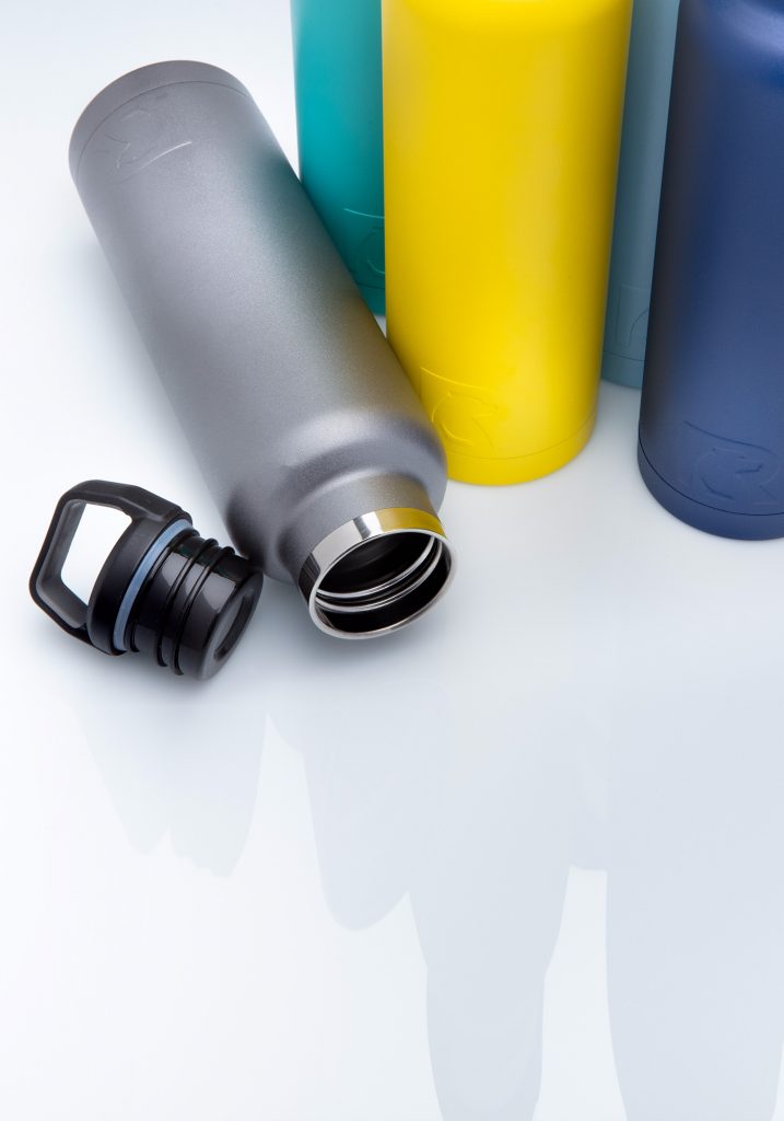
- On the one side, the single product shots are elevating the item on a clean and clear surface, showcasing details of the manufacturing and quality.
- On the other side, large, ambient, and contextual landscape shots would showcase the products in use. The products are staged in a natural and supportive role, while the scenes are celebrating the activities of the heroes – the customers.
This strategy would cater to the two main goals of the new site:
- Move the unique selling proposition away from offering products that are “cheaper than the competition” towards the narrative that the customer will get “great quality for a great price”.
- Focus on RTIC’s brand promise, the “WHY”: RTICs products help the customer to live their outdoor activities in the best way.
Wireframes
We created wireframes for responsive layouts showing the adjustment of copy and image containers in four main breakpoints: small (mobile), medium (tablet), large (laptop), and extra-large (desktop).
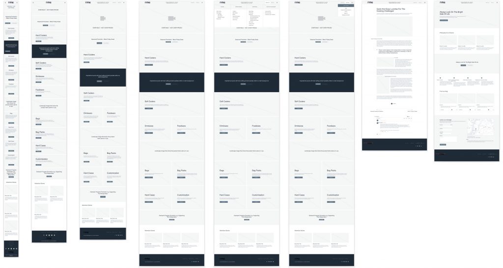
High-fidelity design comps & template prototypes
We created a small, representative selection of design compositions for desktop and mobile in Figma. This gave us an opportunity to align on the new site with the key stakeholders regarding the implementation of the chosen style tile esthetics.
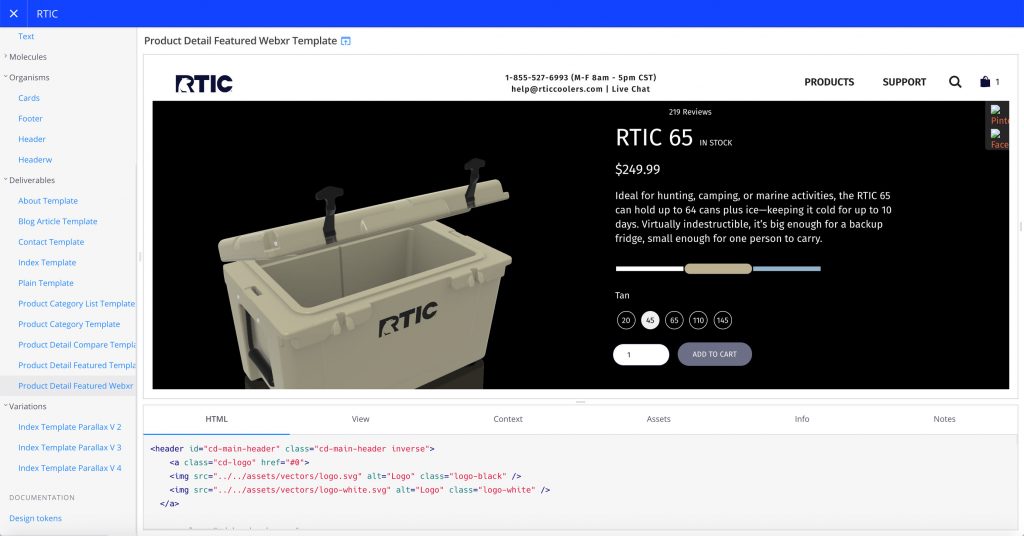
Front-end development & pattern library
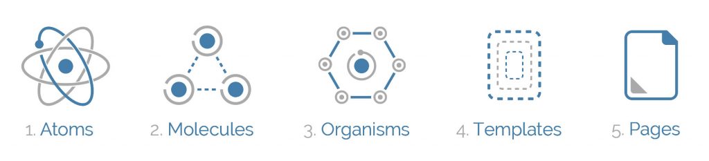
In the production of all page templates, we used the Fractal pattern library and created all assets and elements based on Brad Frost’s Atomic Design Methodology.
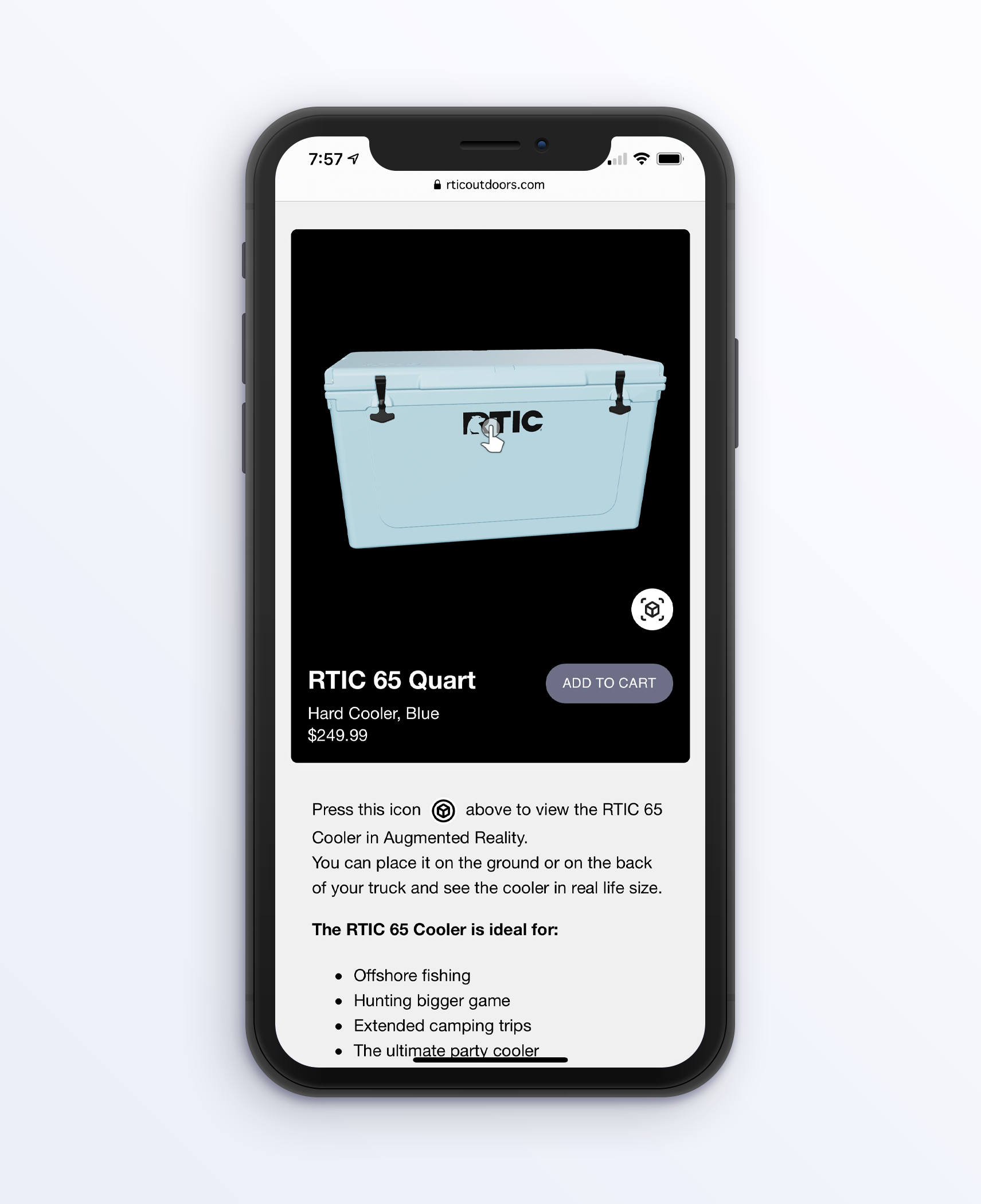
Interactive feature: 3-dimensional product preview
One of the most interesting features of the new site was the visualization of the product in a three-dimensional way. We built this interactive feature loading 3D assets, CAD product files, or photogrammetry scans using the opensource javascript library ThreeJS. This feature allows the visitor to inspect the product in detail from every possible angle without being confined to predefined product angles in photos.
Scrolling effect: dramatic product detail reveal
To increase the perception of product quality and value we added a page scrolling effect that unveils unique product features. This kind of visualization can usually be seen on websites of high-tech consumer electronics. By choosing this visual effect we elevate the product to something uniquely special in this market category.
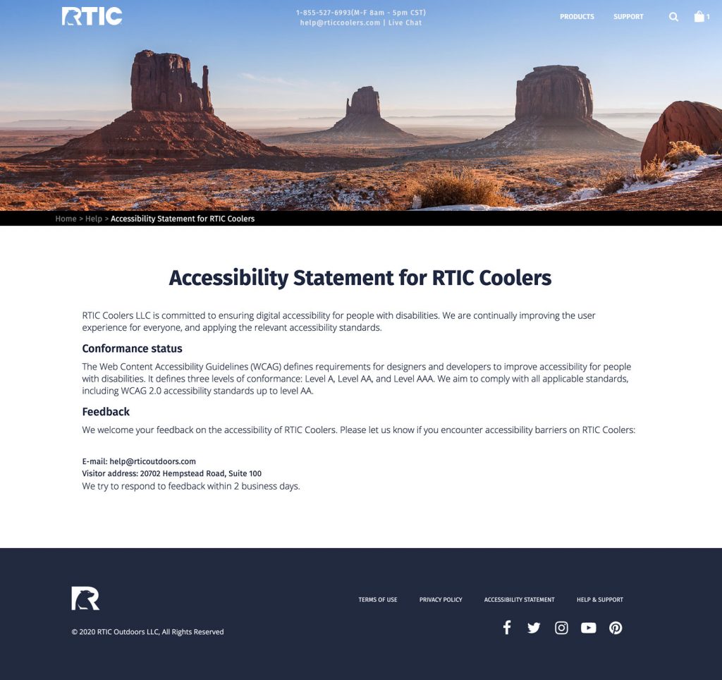
Accessibility statement
Organizations publish an accessibility statement on their websites to describe their policy, goals, and accomplishments related to web accessibility. The statement also includes instructions on how to use specific accessibility technology that is available on the website and how to contact the organization if a disabled visitor runs into problems.
The accessibility statement serves numerous purposes. Therefore, it should be easy to find. The statement is important for the following reasons:
- Showing commitment to your users
The statement will inform visitors with disabilities that they are welcome on the website and that the organization is committed to making the website available to everyone. - Identifying which accessibility standards are used
The World Wide Web Consortium (W3C) developed a set of standards for web accessibility called Website Content Accessibility Guidelines (WCAG). The latest published version of that standard is WCAG 2.1. Some organizations might have other standards that provide guidance for accessibility, such as Section 508 Standards that apply to federal agencies.
This part of the statement will let visitors with disabilities know what to expect, depending on the target standard(s). - Defining accessibility goals for your site
It’s very helpful for a visitor with disabilities to know if there are areas on the website that aren’t yet accessible for them. The statement typically will define accessibility problems on the website, alternatives to gain access — such as by contacting the organization — and plans for resolution. - Defining accessibility accomplishments
The statement will typically include a description of the individual standards that the website meets. If an organization is moving toward complete accessibility, it might be necessary to point out where a visitor with disabilities can find interim solutions, such as downloadable scripts.
The legal issues surrounding accessibility provide additional motivation for publishing a statement. The Department of Justice (DOJ) expects organizations to comply with the Americans with Disabilities Act (ADA), which prohibits discrimination based on disability. The DOJ is in the process of developing specific regulations to govern web accessibility.
Organizations are liable for compliance, and there are already lawsuits against organizations with non-accessible websites. Plaintiffs have often been using the WCAG 2.0 guidelines to illustrate shortfalls in a website’s level of accessibility.
An accessibility statement is a positive way to participate in the transition to complete accessibility for your users and a proactive way to mitigate litigation risk.
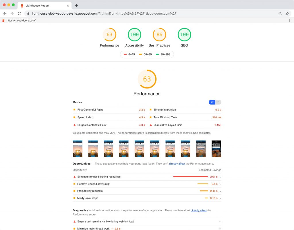
Accessibility (a11y) testing
During the production of the front-end templates, we paid close attention to semantic and standard-compliant web development with web standards, cross-platform, cross-browser compatibility, and progressive enhancement. We were aiming to meet WCAG 2.1 by integrating accessibility screening into our design and development processes.
Using a11y auditing tools like WAVE and Lighthouse, we were testing for:
- Alternative text
- Document structure & hierarchy
- HTML semantics
- Keyboard interactivity
- Color contrast
- Focus management
Implicit & explicit tracking
To keep development costs in check we implemented a combination of implicit (codeless) and explicit event tracking.
RTIC marketing staff wasn’t hands-on with code but wanted the ability to analyze their customer behavior with a point and click solution, so we added implicit tracking by pasting a code snippet to the RTIC site and started capturing all available user interactions from the client-side. RTIC could then analyze different events on their web application, in real-time and retroactively.
Implicit, or catch-all tracking, comes with certain security concerns, like the fact that with capturing of all user interactions and streaming this data to their service, RTIC’s customer’s PII (Personal Identifiable Information) and/or PHI (Personal Health Information) data could be at risk. RTIC took steps to anonymize tracked content and followed strict CCPA (California Consumer Privacy Act) and GDPR (General Data Protection Regulation) guidelines.
Since implicit tracking data output can be messy and might be blocked by some browser clients (with ad blockers), a small selection of call-to-action (CTA) and navigation elements that provide critical business metrics on the RTIC website received an explicit tracking code integration into the back-end structure by the developer team.
For example, we integrated explicit tracking to the “Checkout” button, using an event property that was tracking the product code, quantity, value (cost), and how many product images were viewed, besides tracking the number of times the “Checkout” button had been pressed.
Explicit tracking took planning and extra effort in coding but was essential to create a reliable source of critical business metrics. We decided to use ARIA labels as hooks for the tracking events since accessibility tags were the least likely to change in future code updates thus preventing any disruption or loss of tracked metrics.
We decided on a combination of Amplitude for explicit, and Fullstory for implicit (automated event collection) tracking for RTIC’s new e-commerce site.


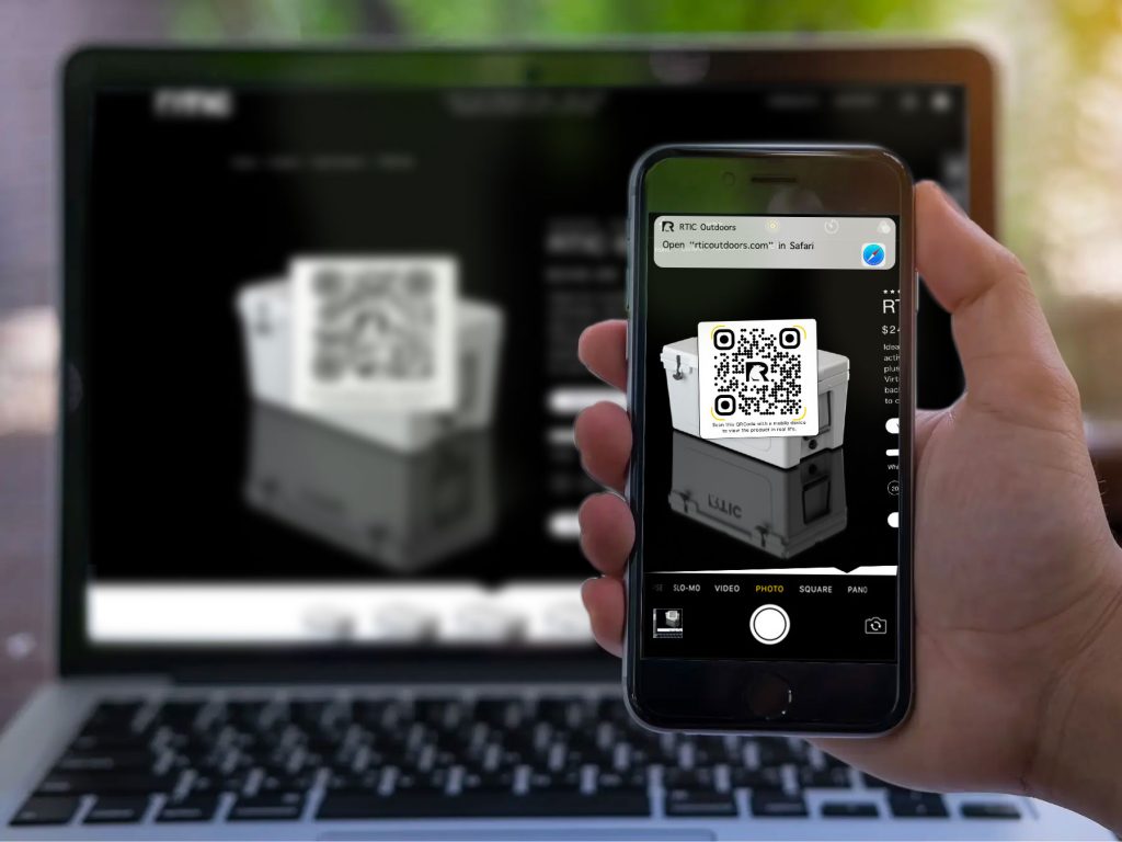
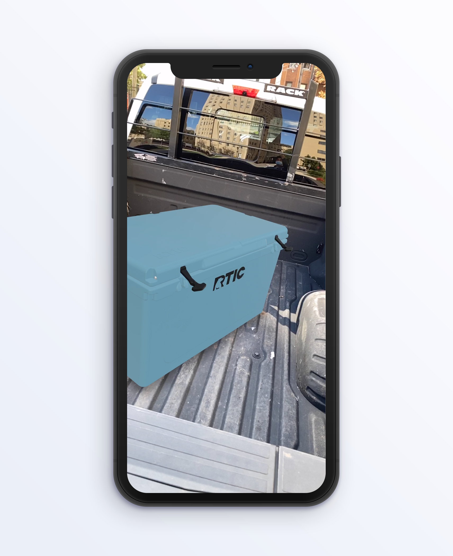
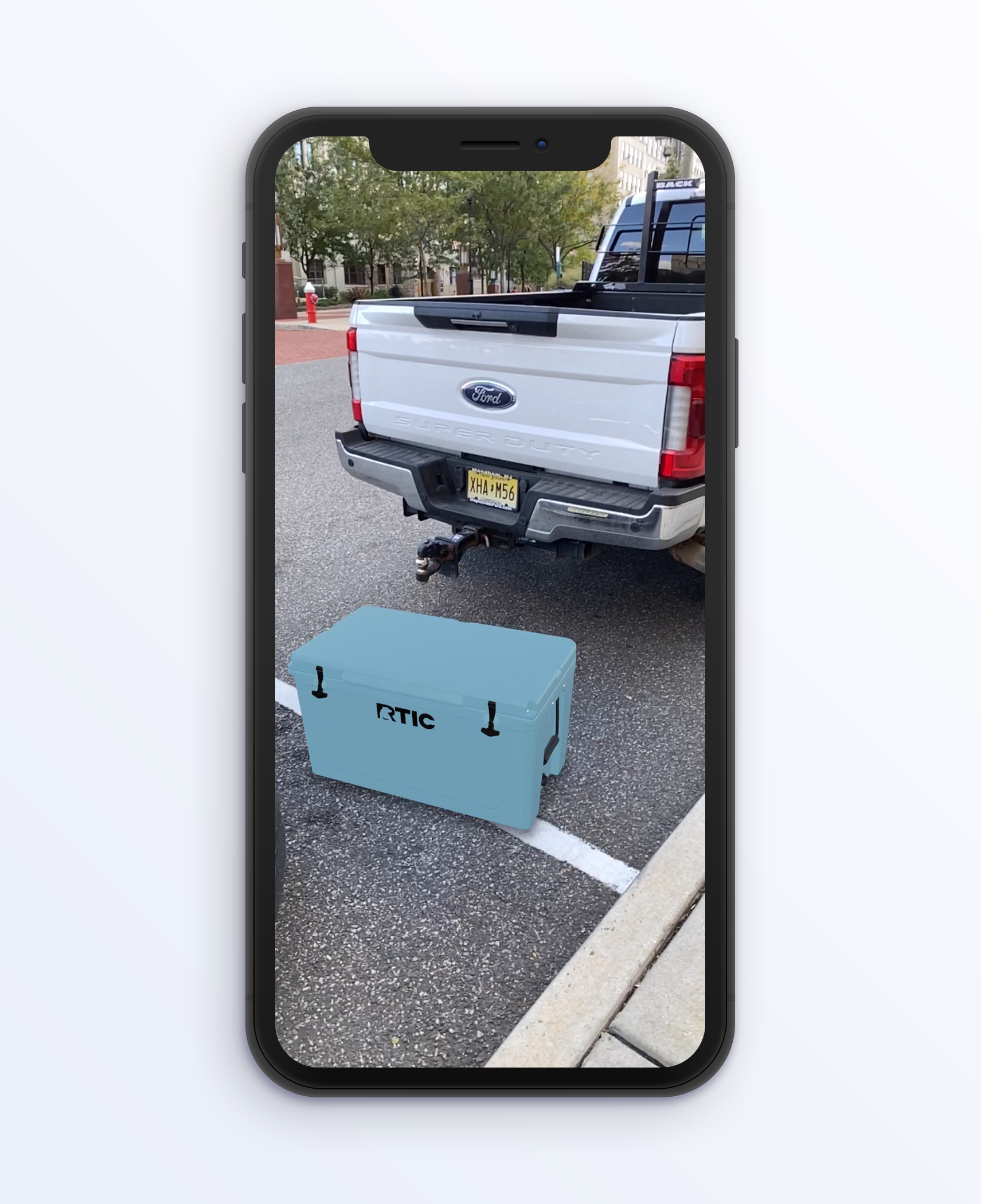
Showing products in real life with augmented reality (WebXR)
One very interesting research insight is that RTIC customers prefer seeing and inspecting their prospective new outdoor product acquisitions in a physical store. In fact, eyeing the size and robustness of the product plays a key role in driving the decision to purchase.
E.g. if you’re heading out on a hunt, the last thing you want is your meat getting spoiled because your cooler couldn’t keep it cold long enough and it spoiled, or because you couldn’t fit it all in. You also don’t want to fill up your cooler with all your game meat only to have the handles break or the lid hinges snap and be unable to carry it or keep it closed.
Or simply – does this cooler fit on the back of my truck?
Projecting the product visually into the customer’s real-life environment with the help of augmented reality solves the user’s need to “seeing it before buying it” and creates the trust and confidence needed to click the purchase button on the new e-commerce site.